Warm vs. Cool Tones: How to Choose the Right Home Color Palette for Every Room
Let’s dive into the world of warm versus cool tones. Choosing the right home color palette can feel overwhelming. One of the most fundamental decisions you’ll make is whether to use warm or cool tones—or perhaps a combination of both. Understanding the psychological and visual effects of color temperature can help you create spaces that not only look beautiful but also feel exactly the way you want them to.
Understanding Warm and Cool Tones
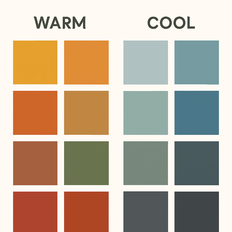
First things first, let’s define what we mean by warm and cool tones. Think about it like this: warm colors remind you of the sun, fire, earth – things that feel cozy and energetic. Cool colors evoke feelings of calm, like water, sky, or a forest at dawn. It’s not just about the obvious reds and blues, but the subtle undertones hidden beneath.
Warm tones: These are the colors with red, orange, and yellow running through them. Think terracotta, golden yellows, warm beiges, coral, rust, and amber. They instantly make you think of a cozy fireplace, a sunny meadow, or a warm hug. They’re all about comfort, energy, and that feeling of being enveloped.
Cool tones: These are the colors with blue, green, and purple undertones. Think navy, sage green, lavender, icy blue, silver, and cool grays. These shades bring to mind clear water, crisp mountain air, or a peaceful forest. They create a sense of calm, serenity, and openness.
The Big Picture: How Colors Make You Feel
Before you even think about swatches or paint chips, consider how you want each room to feel. This is where the magic of color temperature comes in.
- Warm tones: They’re perfect for creating intimate, snuggle-up-and-relax kind of spaces. They make a room feel smaller, cozier, like it’s wrapping you in a blanket. They also tend to spark conversation and can even make food look more appealing – think warm, inviting kitchens or living rooms designed for cozy movie nights. Bonus: They work surprisingly well in rooms that don’t get much natural light, like basements, adding a bit of warmth where it’s needed most.
- Cool tones: These are your go-to for chill, focus, and relaxation. They promote tranquility, making spaces feel more open and airy. Think bedrooms, home offices, or bathrooms where you want that spa-like calm. They encourage concentration, which is great for creative work or deep focus. And hey, they’re fantastic for light-filled spaces, preventing them from feeling overly bright or harsh.
Painting the Room-by-Room Picture
Let’s get specific. How does this apply to different parts of your home?
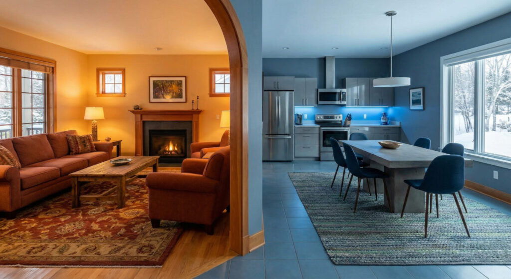
Living Room
This is often the heart of the house, right? It should feel welcoming and comfortable.
- Warm Tones: If you want to invite people in for a good chat or a cozy movie night, warm tones are your friend. Think burnt orange walls, warm taupe accents, maybe some golden yellows in throw pillows. It feels lived-in and comforting.
- Cool Tones: For a more sophisticated, serene vibe, cool tones can work wonders. Imagine cool grays, soft blues, or muted sage greens. It feels open and chic, perfect for that modern, calm living room aesthetic.
- Pro Tip: Many folks do a mix! Cool walls with warm wood furniture and maybe some golden metallic accents – it creates a balanced, layered look that’s really popular.
Kitchen
The kitchen is all about energy and function.
- Warm Tones: Want that cheerful, welcoming kitchen that feels like a social hub? Warm whites, creamy yellows, terracotta accents – it brings energy and makes everything feel cozy and approachable. Great for whipping up morning coffee or hosting friends.
- Cool Tones: Craving a clean, crisp, modern feel? Cool whites, sage greens, soft blues work beautifully. They feel fresh and hygienic, which is a nice touch in the heart of your home. Stainless steel appliances often play well with cool palettes too.
- Pro Tip: Consider your existing elements! Cool marble countertops look amazing against warm wood cabinets, creating contrast and visual interest.
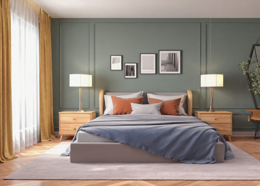
Bedroom
This is your sanctuary. The colors should help you unwind.
- Warm Tones: For a cozy, restful retreat, soft peach walls, warm beige, maybe some muted terracotta or a warm duvet – it creates that feeling of being wrapped up. Great for that pre-bedtime chill.
- Cool Tones: For a truly calming, spa-like atmosphere, cool blues, lavenders, or soft grays are fantastic. They help lower your heart rate and signal time to relax, promoting better sleep. (Proven stuff, honestly!)
- Pro Tip: Often, a cool wall base with warm textiles like throw blankets or wooden nightstands works beautifully – it balances calm with cozy comfort.
Home Office
Productivity is key here, but comfort matters too.
- Warm Tones: Need a burst of energy or inspiration for creative work? Warm yellows or oranges can do the trick. They feel uplifting and stimulating.
- Cool Tones: For deep focus and concentration, blues and greens are your allies. They promote calm, clear thinking, and can help reduce eye strain during long hours.
- Pro Tip: A cool-toned desk or walls with some warm accent pieces (like a wooden desk or a warm rug) can provide that balance of focus and comfort.
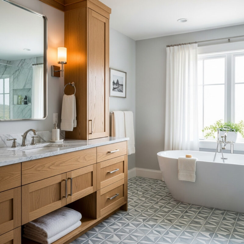
Bathroom
Depending on your desired vibe, the bathroom can be a spa or just a functional space.
- Warm Tones: For a more intimate, cozy bathroom (maybe a smaller one?), warm beiges, soft corals, golden fixtures – it feels luxurious and enveloping.
- Cool Tones: For that fresh, clean, spa-like feeling, cool whites, aquas, or soft greens are ideal. They feel purifying and make small spaces feel less cramped.
- Pro Tip: If your bathroom gets little natural light, warm tones can prevent it from feeling too sterile – like stepping into a cool, empty room.
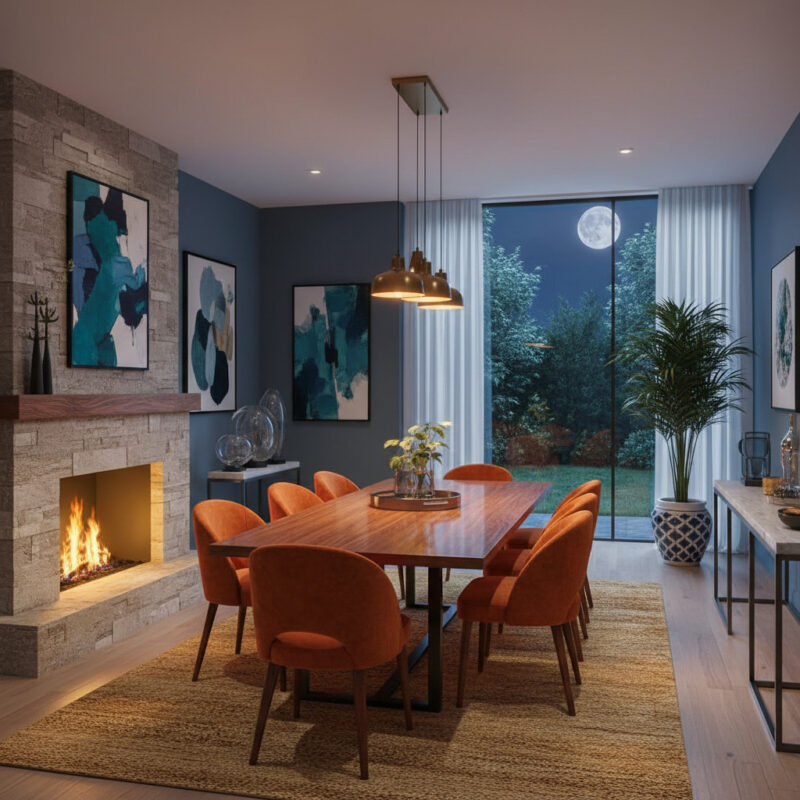
Dining Room
All about gathering and enjoying meals.
- Warm Tones: Want to encourage conversation and make food look divine? Richer reds, burnt oranges, warm browns – they create an intimate, festive atmosphere perfect for dinner parties.
- Cool Tones: For a more elegant, formal dining setting? Deep navy, forest green, or cool charcoal can look very sophisticated and refined.
- Pro Tip: Lighting plays a huge role here. Warm light bulbs can add extra coziness to cool-toned rooms, while cool metallic table settings or fixtures can balance warm spaces.
More Than Just Color: Other Factors to Consider
Lighting is HUGE. What looks good during the day might look totally different under artificial light. A “cool” color might look stark at night under certain bulbs, while a “warm” color might glow differently in daylight.
The size and shape of the room matter too. Need to make a small room feel bigger? Often, cool tones work best as they tend to recede visually. Love the cozy feeling in a small space? Warm tones can embrace it intentionally. And ceiling height? Low ceilings often look fantastic with light, cool colors to make them feel taller. High ceilings can handle deeper, warmer colors without issue.
Don’t forget your existing elements! That lovely wood flooring? It might have warm undertones, so maybe lean towards cool walls. Built-in cabinetry? Check its undertones – they’ll influence your wall color choice significantly.
The Power of Combination
You don’t have to stick to one or the other. Mixing can be brilliant. Maybe you love the calm of cool blues but want a hint of warmth? Try adding warm textiles or accents. Or maybe you prefer warm tones but want a touch of cool? A cool element can lift the space. This thoughtful balance is often what creates the most sophisticated and interesting interiors.
So, the next time you’re painting or choosing decor, think about temperature. Warm for cozy and energy, cool for calm and openness. And don’t be afraid to experiment – maybe start with one wall or an accent piece to see how it makes you (and others!) feel. I’ve found that testing it in different lighting conditions is really helpful too.